Hey there, welcome to my little corner of the web—glad you stopped by. I’m Jake, and I’ve been in the new design supply game for just over 8 years now. Over that time, I’ve worked with everything from tiny startup cafes redoing their whole vibe to mid-sized tech companies that suddenly realized their brand felt like a leftover from 2012. And let me tell you: creating a brand new design identity isn’t just picking a cool color palette or a fancy logo. It’s the kind of thing that makes someone go, “Wait, that’s them” before they even read a single word. Today, I’m breaking down how we do it at our shop—no corporate jargon, just stuff that actually works. New Design

First things first: let’s get one thing straight. You can’t design a new identity in a week. I see clients all the time come in saying, “We need a whole new look by next Friday” and my answer is always, “Cool, but that’s a coat of paint, not a new identity.” A real new design identity is rooted in who you actually are—your people, what you stand for, the weird little quirks that make you different from everyone else. Skip that step, and you’ll end up with something that looks great on Instagram but doesn’t move the needle for your business.
Let’s walk through the first big step: digging into the “why” before the “what.” When a new client walks through our door, the first thing I don’t ask is, “What logo do you want?” I ask them to answer three stupidly simple questions. No lies, no fluff—just real answers. First: Who the hell are you talking to? Like, literally. If you’re a sustainable dog toy brand, your audience isn’t just “dog owners” — it’s the 28-38 year old urbanites who hike with their pups, buy organic peanut butter for themselves, and get grumpy about plastic waste. If you’re a local bakery, it’s the college students grabbing mid-afternoon snacks, the retirees coming in for their daily croissant, and the parents picking up cookies for their kid’s soccer game. If you skip this, your design will be generic enough to blend into every other brand on the shelf.
Second question: What do people actually say about you when you’re not in the room? Do clients call you “that one shop that stays open late for last-minute gifts”? Or “the tech company that fixes my laptop in 20 minutes for half the price of the big guys”? This is stuff you might be too close to notice. We once worked with a bookshop that thought they were “just a regular bookstore” until we asked regular customers what they loved most—they said it was the way the owners would bring free hot cocoa to anyone browsing the winter section, even if they didn’t buy anything. That became a core part of their new identity, not some random afterthought.
Third question: What do you wish people said about you? If you’re a construction company, maybe right now people say “they finish jobs on time” but you want them to say “they care about leaving my yard looking better than they found it.” That gap between “what is” and “what could be” is where your new identity lives. Once we got a client to write that down, their whole design direction clicked—they used soft, warm grays instead of generic construction blue, added little hand-drawn icons of tools holding flowers to show their attention to detail, and even adjusted their signage to feel less like a big corporate building and more like a neighborly shop.
Okay, so you’ve got the why down. Now comes the fun part: brainstorming without rules. A lot of people jump straight to “logo sketches” or “color palettes” and that’s a mistake. First, we do what we call “mood boarding that doesn’t suck.” No cutting out fancy magazine ads just because they look cool. Instead, we pull real stuff that matches the answers to those three questions. For the dog toy brand, we’d pull photos of pups hiking, close-ups of organic cotton, videos of people laughing while playing with their dogs, even screenshots of Instagram captions from their favorite customers. For the bakery, it might be the crinkle of a fresh croissant bag, the smell of cinnamon (we use subtle warm spice tones in their palette), handwritten notes from regulars who leave reviews like “your chocolate chip cookies taste like my grandma’s.”
Here’s the trick with mood boards: we don’t show them to clients at first. We show them to our design team, and we ask them to pull whatever makes them feel something—excited, nostalgic, even a little annoyed. If the team is excited, that’s a sign it’s resonating. Once we have 20 or 30 real, messy pieces, we start grouping them. The dog toy brand’s board might have three big groups: “adventure with my pup,” “no weird chemicals,” “fun for both of us.” That’s where the identity’s core themes come from—no more vague “we want something playful.” We have concrete themes that guide every single design choice.
Next up: building the actual system, not just a logo. I swear, this is the part most people miss. A new design identity isn’t one logo and that’s it. It’s a whole system that works everywhere—your website, your packaging, your social media, your business cards, even the way your delivery bags look. If you just change your logo but keep using the same random fonts for your Instagram posts, it feels like a Band-Aid, not a new identity.
Let’s talk about fonts first. A lot of people think “cool font = good design.” No. Fonts have personalities, and they need to match your brand. If you’re a fancy skincare brand, a super thin, elegant serif might work. If you’re a skate shop for teens, a messy, grungy hand-drawn font makes way more sense. And here’s another rule: stick to 2-3 fonts max. One for headlines, one for body text, maybe a fun one for accents. I once saw a café use 7 different fonts on their menu and it was impossible to read, not to mention it felt chaotic—no part of their identity that way.
Colors are even more important than most people think. Colors trigger feelings before people even notice anything else. We did a project for a teen mental health non-profit a couple years ago. At first, they wanted bright, neon colors because they thought teens liked that. But when we tested it, neon felt overwhelming, like yelling at someone. Instead, we went with soft, muted blues (they’re calming, not sad) and subtle yellows (friendly, not hyper). The non-profit told us later that new clients mentioned feeling safe the second they saw their website, and that’s exactly what they wanted. Pro tip: test your colors in different places. A color that looks great on a white website background might blend into a retail shelf next to other products. We always do shelf tests for in-store brands, even if it feels silly.
The logo? It’s the centerpiece, not the whole show. Your logo should be simple enough that someone can draw it from memory, but it should also mean something. When we worked with that local bookshop I mentioned earlier, their old logo was just a generic stack of books. Their new logo is a hand-drawn open book with a little steam coming off the top—like it’s a cup of tea, which ties back to that hot cocoa thing we talked about. It’s memorable, it fits their vibe, and it works tiny (on a business card) and big (on the side of their building). But we also made sure it works without color, works in black and white, because sometimes you need it on a shipping label or a receipt. If your logo only looks good in full vibrant color, it’s not a great logo.
Now, here’s the part that makes or breaks every identity: testing it on real people, not just your friends or family. Your mom will love anything you make, and your best friend will lie and say it’s perfect. We do what we call “real user tests” for every single project. We grab 5-7 people who match the audience you’re targeting, show them the new designs, and ask them simple questions: “What do you think this business does?” “How does this make you feel?” “Would you trust this brand with [whatever your service/product is]?” If most people say, “Oh, that’s a gym” when you’re a plant shop, you messed up. If they say, “This feels like a place where I’d bring my anxious kid” when you’re a mental health clinic, that’s a win.
I’ll be honest, we had a project go wrong once because we skipped this step. We designed a new identity for a pet grooming salon, used bright, playful colors, a logo with a dog and a bow, and felt it was perfect. Then we tested it with actual clients: three people said it felt “too childish” because they had big, golden retrievers and wanted to feel like their pup was getting professional care, not played with. We went back, toned down the colors, made the logo a little more polished, added subtle icons of grooming tools, and suddenly everyone got it. That test saved the whole project—we would’ve launched something that turned off half their audience.
Once all that’s done, you’re not finished yet. You need a brand guide—something simple, something your team can actually use, not a 100-page book no one will read. Our brand guides are usually 15-20 pages, max. They have the core themes, the fonts, the exact color codes (for print and digital), do’s and don’ts (like “never stretch the logo” or “always use the secondary accent color for sale signs”), and even examples of how to use it on common things like social media posts or business cards. A brand guide turns your new identity into something consistent—so when your intern posts a photo of a new product, it doesn’t look like it’s from a different company.
Wait, let’s circle back to why this actually matters. Because a new design identity isn’t just a pretty look. It’s how people remember you, how they choose you over the competition. When that bookshop launched their new identity, their sales went up 30% in the first three months. People didn’t just come in for books—they came in because the design made them feel like they were part of something, not just a customer. The dog toy brand we worked with? They got picked up by three major pet stores because buyers saw their packaging and thought, “These are the toys I want to put on my shelves.”
I hear people all the time say, “Our brand is fine, we don’t need to change it.” But “fine” doesn’t stand out. In a world where people scroll through hundreds of brands a day, you need something that stops them for two seconds. Not because it’s loud, but because it’s honest. That’s the secret no one tells you: the best new design identities aren’t the flashiest ones. They’re the ones that feel like they were made just for the people who care about your brand.
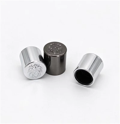
Now, if you’re reading this and you have a new project—whether you’re a small business wanting a whole new look, or a larger brand that feels stuck in the past—let’s chat. We’ve worked with all kinds of businesses, from local cafes to national product lines, and we don’t do the fancy, overpriced identity builds that take six months and cost a fortune. We do real, human-centered design that actually works for your business. Just reach out to our team to set up a chat, no strings attached. We’ll walk through your goals, answer any questions, and see if we’re a good fit. No pressure, no jargon, just straight talk about what your brand needs to stand out.
Crystal Oud Burner References
- Designing Brand Identity: An Essential Guide for the Whole Branding Team, Alina Wheeler
- The Elements of User Experience: User-Centered Design for the Web and Beyond, Jesse James Garrett
- Emotional Design: Why We Love (or Hate) Everyday Things, Don Norman
- Content Design: A Handbook for Writing for Users, Sarah Winman
- Logo Design Love: A Guide to Creating Iconic Brand Identities, David Airey
Winkuan Industrial Co., Limited
We’re well-known as one of the leading new design manufacturers and suppliers in China since 1996. Please rest assured to buy high quality new design made in China here from our factory. We also accept customized orders.
Address: No.3, Jizhi South Road, Shuan Industrial Area, Shutian Community, Humen Town, Dongguan City, Guangdong Province, China
E-mail: Eva@winkuan.net
WebSite: https://www.winkuanpackage.com/
